

An image has been doing the rounds today CLAIMS to be the new 18/19 Celtic away kit, but we’re a little bit sceptical.
While we are absolutely in love with the retro look (See image below Armstrong graphic) the logo on the jersey looks like a Celtic fan has been hard at work on photoshop letting their creative juices flow.
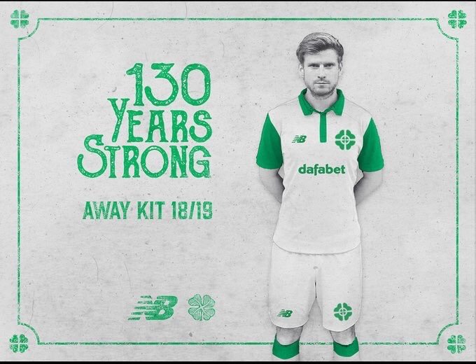

If this turns out to be the away shirt or some variation of this we’ll be giving it two thumbs up!
The last two efforts have been a pink jersey and hoops with two different shades of green.
As is the norm nowadays, Celtic will be offering up three new kits towards the end of this season and in the close season.
They could all be belters if New Balance go retro!
—-UPDATE—-
Confirmation this looks to be a well thought out concept kit for anyone getting their hopes up.
Sigh of relief. pic.twitter.com/Rkg4A1GBAL
— – (@Tam_Selleck) March 21, 2018


It’s honkin man.
Much prefer the Black efforts that were doing the rounds a couple of months ago.
On the surface it doesn’t look well thought out at all…even looking more like a top a jockey would wear.
But, if you look at the original behance page from Dec last year, the explanation of HOW the concept crest came about (amalgamation of the original 1888 crest and today’s) – it actually makes more sense.
But yes, it won’t happen so those that don’t like it can rest assured that it won’t be happening. H.H.
Im glad it isnt, because it looks cheap and shite
Like the strip but don’t like the badge at all HH ???